
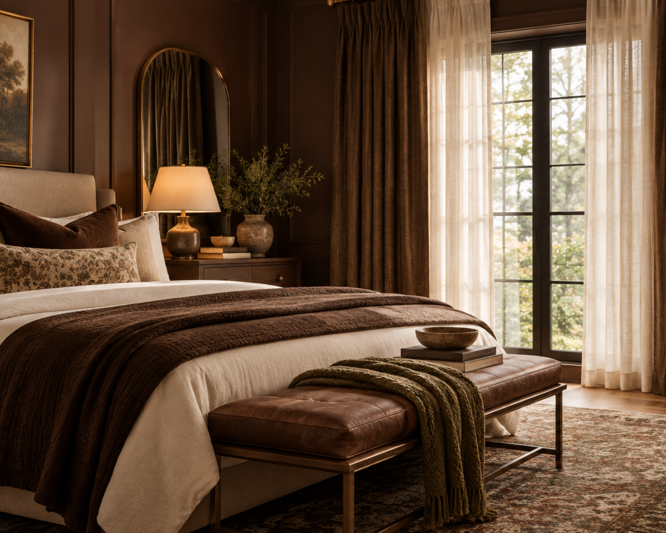
Brown is having a moment, but this isn’t the brown of predictable fall decorating.
Chocolate, walnut, cinnamon, tobacco, caramel, and other warm brown tones are showing up across interiors in increasingly sophisticated ways. Homes & Gardens recently identified chocolate brown as one of fall 2026’s defining colors, while its broader fall trend coverage points toward warmer, richer palettes and more tactile materials.
For designers, the more interesting question isn’t whether brown is trending. It’s how to build a layered palette around it, including at the window.
The hardware you specify can reinforce the warmth of the room, introduce contrast, or bring another layer of materiality to the design.
Start With the Tone of Brown
Not every brown creates the same atmosphere.
Chocolate and espresso can give a room a deeper, more enveloping feeling. Cinnamon, caramel, and tobacco bring warmth without quite as much visual weight. Walnut introduces richness while still feeling natural and versatile.
The surrounding materials matter just as much.
Pairing rich brown with warm wood, linen, natural stone, olive, cream, or aged metal can create a palette that feels layered rather than overly dark. These combinations also align with the broader 2026 shift toward earthy, livable colors and natural, tactile materials.
That’s where hardware becomes another part of the palette.
For a Warm, Natural Palette: Think Mistral
When brown is paired with natural materials, the goal is often warmth without heaviness.
Think:
Walnut + linen + stone + warm metal
For these interiors, Mistral is a natural fit.
Its more relaxed, material-driven character works beautifully alongside warm woods and organic textiles, making it a strong choice for spaces where the palette is intended to feel comfortable, collected, and sophisticated rather than formal.
The key is allowing the hardware to feel connected to the materials around it without requiring an exact match.
For Richer, More Decorative Interiors: Consider Opera
Brown also lends itself beautifully to rooms with more drama.
A chocolate-toned library. A dining room with dark wood. A bedroom layered with velvet, patterned textiles, and antique-inspired pieces.
In these settings, the hardware doesn’t necessarily need to disappear.
Opera can contribute another decorative layer, particularly when the room already embraces richer materials and more expressive detailing.
Pairing deeper brown tones with warm metallic finishes, plush textiles, and decorative hardware creates a palette that feels intentional and dimensional.
The result is less dark room and more richly layered room.
Brown Doesn’t Mean Traditional
This is one of the reasons the current brown trend is so interesting.
The same color can move between very different design languages depending on what surrounds it.
Brown with antique wood and decorative detailing can feel traditional or collected.
Brown with crisp upholstery, sculptural furniture, and clean architectural lines can feel distinctly contemporary.
For a more modern interpretation, DECO [R] offers an opportunity to introduce stronger architectural character without relying on traditional ornament.
And when the goal is for the window treatment to remain visually quiet, Techno Track can provide a streamlined solution that allows the richer palette, architecture, or fabric to take the lead.
Don’t Match Every Finish
A room built around brown doesn’t need brown hardware.
In fact, contrast can make a richer palette feel more sophisticated.
Consider:
Chocolate + refined brass
Walnut + darker metal
Cinnamon + warm cream
Espresso + soft linen
Brown + muted olive
Rather than matching every finish, look for relationships between them.
If the room already has warm wood, the hardware might echo that warmth through its finish. If the walls and millwork are dark, a lighter metallic can create contrast at the window. If the furnishings carry most of the visual weight, a more restrained hardware profile may provide balance.
The objective isn’t coordination for its own sake. It’s connection.
Let the Fabric Change the Equation
The same hardware can feel completely different depending on the fabric surrounding it.
A heavyweight velvet in chocolate or tobacco may call for hardware with enough presence to feel proportional. A lighter linen in cream or camel may work better with a quieter profile.
This is where Novi can be particularly useful for designers working within a more transitional or understated scheme. Its slimmer profile can complement lighter fabrics and layered neutral palettes without adding unnecessary visual weight.
The hardware becomes part of the overall composition rather than competing with the drapery.
Use Architecture to Guide the Specification
Before selecting a finish or collection, look at what the room is already saying.
Is there substantial walnut millwork?
Are the walls color-drenched?
Is the ceiling detailed?
Are the windows expansive?
Is the room intentionally minimal?
These questions can help determine whether the hardware should add character or provide restraint.
A richly paneled library may welcome the decorative presence of Opera or Hunley.
A contemporary space with large expanses of glass may benefit from the cleaner lines of Techno Track.
A warm transitional interior might call for the versatility of Novi.
And a room centered around natural materials could make beautiful use of Mistral.
The brown palette is only the beginning. The architecture tells you where to take it.
Brown Can Be Warm Without Feeling Heavy
One of the biggest advantages of brown is its versatility.
It can create depth without the severity of black. It can feel sophisticated without feeling formal. And when paired with lighter textiles, natural materials, and thoughtful metallic accents, it can create warmth without making a room feel visually closed in.
That balance is especially important at the window.
The right hardware can provide a visual transition between the architecture, fabric, and surrounding furnishings, helping the window treatment feel integrated into the room.
Designing the Window Into the Palette
Brown may be having its moment, but its appeal goes beyond a seasonal trend. Designers are using richer, warmer colors because they bring depth, comfort, and personality to interiors.
And the window is another opportunity to build on that feeling.
Whether the room calls for the natural warmth of Mistral, the decorative character of Opera, the refined presence of Hunley, the architectural direction of DECO [R], the streamlined profile of Techno Trac, or the understated flexibility of Novi, the hardware should feel like an intentional part of the material story.
Because the best hardware doesn’t simply match the room. It belongs in it.